

Have you ever struggled to navigate a website on your phone? That’s a common problem caused by poorly designed websites. Unified Computing emphasizes the importance of responsive web design, which automatically adjusts content and layout to fit any screen size. Let’s explore why responsive design is crucial for modern web design success.
What is a Responsive Website?

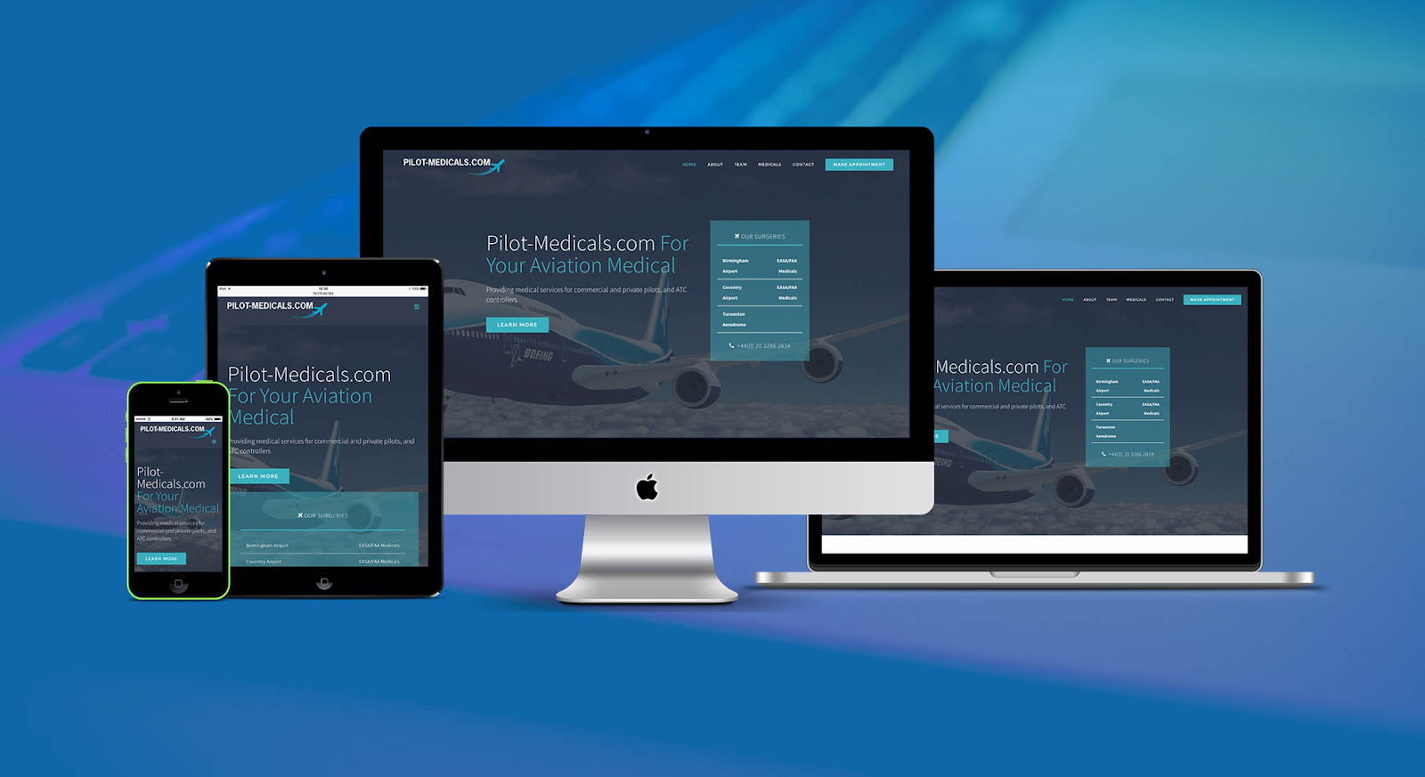
A responsive website is designed to automatically adjust its layout, images, and content to fit different screen sizes and resolutions. Whether you’re browsing on a 27-inch desktop monitor or a 5.5-inch smartphone, a responsive website provides an optimized experience without the need for separate mobile or desktop versions.
The foundation of responsive web design lies in CSS media queries and flexible grids that adapt according to the user’s device. Instead of creating a different layout for each screen size, a responsive website dynamically adjusts, ensuring the content remains accessible and visually appealing on all devices.
Why Does Your Business Need a Responsive Website?
- Improved User Experience (UX): User experience is a key factor in determining whether visitors stay on your website or leave. A responsive website ensures that visitors can navigate easily, no matter what device they use. An easy-to-read and visually appealing website keeps users engaged and increases the chance of conversions.
- Higher Search Engine Rankings: Search engines, especially Google, prioritize mobile-friendly websites. Since 2015, Google has included mobile responsiveness as a ranking factor in its algorithm. Having a responsive website can improve your SEO and help your business rank higher in search engine results pages (SERPs).
- Cost-Effective: Instead of maintaining multiple versions of your website (one for mobile, one for desktop), a responsive design allows you to manage a single site. This reduces the time and cost of development and maintenance while ensuring consistency across platforms.
- Faster Loading Speed: Responsive websites are optimized to load quickly on all devices, which is another critical factor for SEO and user satisfaction. Slow-loading sites can lead to high bounce rates, but responsive design helps ensure that your website remains efficient and accessible.
Key Elements of Responsive Web Design
- Fluid Grid Layout: Responsive websites use flexible grid layouts that scale content proportionally based on the screen size. This allows elements like text, images, and buttons to resize automatically, ensuring they look good on all devices.
- Flexible Images: To prevent images from appearing too large or too small on different devices, responsive websites use CSS techniques that allow images to scale within their containing elements. This prevents distortion and maintains visual appeal.
- Media Queries: Media queries in CSS enable your website to detect the device’s screen size and apply the necessary styles. For example, a website might display three columns on a desktop but reduce it to one column on a smartphone to improve readability.
- Touch-Friendly Design: Since more users are browsing websites on touch devices, it’s essential to consider touch gestures in your design. This includes larger buttons, easy navigation, and spacing that accommodates users’ fingers instead of a mouse cursor.
Best Practices for Designing a Responsive Website
- Start with Mobile-First Design: Building your website with mobile in mind ensures it works well on smaller screens before scaling up for larger devices. This approach can help you focus on essential content and functionality while reducing clutter.
- Use Breakpoints Wisely: Breakpoints are points where the website layout changes based on screen size. The most common breakpoints are for smartphones, tablets, and desktops. Make sure to test your website across different devices to identify when adjustments are necessary.
- Optimize for Performance: Minimize file sizes, optimize images, and reduce unnecessary code to ensure that your website loads quickly, especially on mobile devices. Users expect fast-loading pages, and Google rewards websites that offer speed.
How Responsive Websites Impact SEO
As mentioned earlier, Google’s mobile-first indexing means that the mobile version of your website is prioritized in search engine rankings. This makes having a responsive website critical to your SEO strategy.
Responsive websites also reduce bounce rates—the percentage of visitors who leave after viewing only one page. If your website isn’t mobile-friendly, users are likely to leave, signaling to search engines that your website isn’t offering a good user experience.
By ensuring that your website works flawlessly across all devices, you improve dwell time (the amount of time users spend on your site), which is another important SEO signal.
Responsive Web Design at Unified Computing
- Website Design Process: Unified Computing follows a thorough website design process, involving various teams and constant client feedback to ensure a high-quality and effective product. The goal is to create a website that meets the client’s exact needs.
- Professional and Dedicated Team: Unified Computing prides itself on a team that is professional and attentive to detail. Their guidance and recommendations ensure the website is both unique and feature-rich, utilizing the latest technologies for maximum efficiency.
- Timely Project Completion: Thanks to a clear process and well-coordinated teams, Unified Computing delivers projects on time without sacrificing quality.
- Competitive Pricing: Unified Computing offers various design packages at competitive rates, making high-quality web design accessible to a wide range of clients.
What Unified Computing Offers
- Responsive Design for All Devices: Unified Computing ensures that websites are fully responsive across devices, including mobile phones, tablets, and desktop computers.
- SEO-Optimized Code: Unified Computing specializes in crafting SEO-friendly websites, drawing on our extensive experience in web development and SEO.
- Website Management Guidance and SEO Solutions: Beyond just delivering the website, Unified Computing provides detailed management instructions and SEO advice to help clients achieve top search rankings. The value you get from Unified Computing’s services far exceeds the initial investment.
Conclusion
A responsive website is more than just a technical requirement—it’s a strategic decision. If you’re looking to boost your website’s performance, investing in a responsive design is a smart move that will pay off in the long term. Partner with Unified Computing to create a responsive website that delivers results.